
Building a WordPress website is easier than ever, but that also means it’s easy to make small design mistakes without even realizing it. These mistakes might seem minor, but they can quietly push visitors away before they even get to know your business.
Let’s go through the most common ones, explained simply, along with easy ways to fix them.
1. Too Many Colors and Fonts
It’s tempting to make your website “stand out” by using lots of different colors and fonts. But instead of looking exciting, it usually looks messy and unprofessional.
The fix: Stick to two or three brand colors and one or two fonts throughout your entire website. Consistency makes your site look polished and trustworthy.
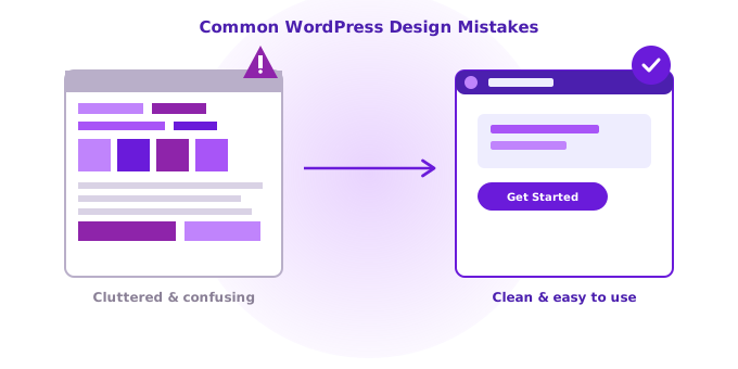
2. A Cluttered Homepage
Trying to show everything at once, every service, every announcement, every image, overwhelms visitors instead of guiding them. When people don’t know where to look, they usually just leave.
The fix: Focus your homepage on one clear message and one clear action, like “Book a Consultation” or “Shop Now.” Keep it simple and let other pages handle the details.
3. Slow Loading Speed
A beautiful website means nothing if it takes forever to load. Most visitors won’t wait around, they’ll simply click away and visit a competitor instead.
The fix: Compress large images, remove unnecessary plugins, and choose a lightweight theme. Small changes here can make a big difference in speed.
4. Poor Mobile Experience
Many websites still look great on a computer but fall apart on a phone, with tiny text, overlapping buttons, or images that don’t resize properly.
The fix: Always check how your website looks on mobile after making changes. Most modern themes adjust automatically, but it’s worth double-checking regularly.
5. Confusing Navigation Menus
If visitors can’t quickly find what they’re looking for, like your services, pricing, or contact page, they’ll assume your business is hard to deal with too.
The fix: Keep your menu short and clear. Use simple labels like “Services,” “About,” and “Contact” instead of clever but confusing wording.
6. Hard-to-Read Text
Light gray text on a white background might look modern, but it’s often frustrating to actually read, especially for visitors with visual difficulties.
The fix: Use dark, high-contrast text on a light background, or vice versa. Readability should always come before style trends.
7. No Clear Call-to-Action
Some websites look great but never actually tell visitors what to do next. Without a clear direction, people simply browse and leave without taking action.
The fix: Add a clear, visible button like “Get a Quote” or “Contact Us” on every important page, guiding visitors toward the next step.
8. Ignoring White Space
Cramming too much content close together makes a website feel overwhelming and hard to focus on.
The fix: Add breathing room between sections, images, and text. White space isn’t empty space, it actually helps guide the visitor’s eyes and makes content easier to digest.
9. Outdated or Generic Stock Photos
Using the same generic stock photos that every other website uses makes your business blend in instead of standing out, and can even feel a little untrustworthy.
The fix: Whenever possible, use real photos of your business, your team, or your actual work. Authentic images build far more trust than generic stock images ever could.
10. Forgetting to Test Before Publishing
Many design mistakes happen simply because changes were never tested before going live, leading to broken layouts or awkward spacing that visitors notice immediately.
The fix: Always preview changes and test them on different screen sizes before publishing. A few extra minutes of checking can prevent visible mistakes from being seen by real visitors.
The Bottom Line
None of these mistakes mean your website is a failure, they’re simply common issues that even experienced website owners run into. The good news is, every single one of them is fixable, often without needing a developer. A few thoughtful adjustments can transform your website from something that just exists into something that genuinely represents your business well.